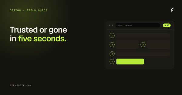
A potential client lands on your homepage. They're stressed, often newly injured or recently fired or just served. They don't read carefully. They glance, judge, and either stay or leave.
Five seconds. That's the window most usability research lands on for legal first-impressions. Faster than for almost any other industry, because the visitor doesn't want to be there in the first place. They're vetting you against three other tabs.
Five elements determine whether they stay. None of them are subtle.
What a stressed visitor judges in five seconds
Your homepage, above the fold 5 seconds
A stressed visitor glances, judges, and stays or leaves. Five things decide it, and none of them are subtle.
Value statement
What you do and for whom, in plain words, with the practice area and the jurisdiction named.
A real photo
The actual lead attorney in the actual office. Not a gavel, not a stock boardroom.
Named credentials
Full name, bar admission, law school, years in. Near the hero, not buried on page two.
A specific result
A named 2024 verdict beats "$50M+ recovered." The detail is what does the trust work.
One clear next action
A single primary CTA that says what happens on click, not three buttons competing.
1. A clear value statement above the fold
The headline at the top of the page should answer one question in plain language: what do you do, and for whom?
Bad versions of this:
- "Justice. Compassion. Results." (means nothing)
- "Your Trusted Legal Partner Since 1985" (says nothing about practice)
- "Experienced Attorneys Fighting For You" (every firm says this)
Good versions:
- "Personal injury and workers' comp representation across Massachusetts."
- "Federal criminal defense in the Eastern District of New York."
- "Estate planning and probate for Iowa families."
Specific. Practice area named. Jurisdiction named. The visitor knows in two seconds whether you're the right firm to even keep reading.
2. A real photo of a real person
The hero image matters more on legal sites than on almost any other category. The visitor is trying to decide if they trust whoever they're about to call. Stock photos of a gavel, a diverse group of generic professionals, or a courthouse exterior signal "we don't have anyone real to show you" loudly.
What works:
- A clean photo of the lead attorney, real and recent
- A team shot if the firm has more than one attorney and the photo is good
- An attorney photographed in their actual office
- The same attorney photographed during a CLE talk or community event
What doesn't work:
- Anything from Unsplash, Shutterstock, Getty, or Adobe Stock
- Generic "lawyer at desk" images
- Vague abstract images (scales of justice, columns, etc.)
- The firm logo enlarged with no human element
The single highest-converting hero image we've seen on a law firm site is a 30-second portrait of the lead attorney shot against their actual office wall by their assistant on an iPhone. Better than anything an agency would have produced for $3,000.
3. Named credentials and bar admissions visible
Before scrolling, the visitor wants to know you're a real licensed attorney. This is more important in legal than in any comparable industry. Skip it, and your page reads the same as a directory aggregator pretending to be a firm.
The minimum:
- Attorney name (full, real)
- Bar admission state (linked to the bar profile if possible)
- Law school
- Years of practice or admission year
This goes near the hero, not buried in the About page. The visitor's threshold for trust is set in the first scroll. Wait until page two and you've already lost half the people you would have converted.
These same credentials do double duty. The named attorney, the bar admission, the law school, and the years in practice aren't just human trust signals; they're the exact entity and expertise signals search and AI engines read to decide whether a real, credentialed person stands behind the site. A homepage that names its lawyer clearly is easier for a person to trust and easier for a machine to recognize, which is the whole argument of E-E-A-T for law firms. Trust and machine-legibility turn out to want the same things.
4. A specific result, not a vague claim
"Over $50 million recovered for our clients" is forgettable. "$1.2M verdict in a 2024 wrongful termination case (Doe v. Acme Industries)" is memorable. Specificity is what separates a credible firm from a sales pitch.
The hero section should include at least one concrete result, with as much detail as bar advertising rules in your state permit. The detail itself functions as the trust signal: it shows you've done this work and you're willing to say so publicly.
If results are restricted in your state, the equivalent is a named case where the firm appeared as counsel of record. A page that says "represented appellant in Smith v. State (2023, published opinion)" is doing the same trust work without the dollar figures.
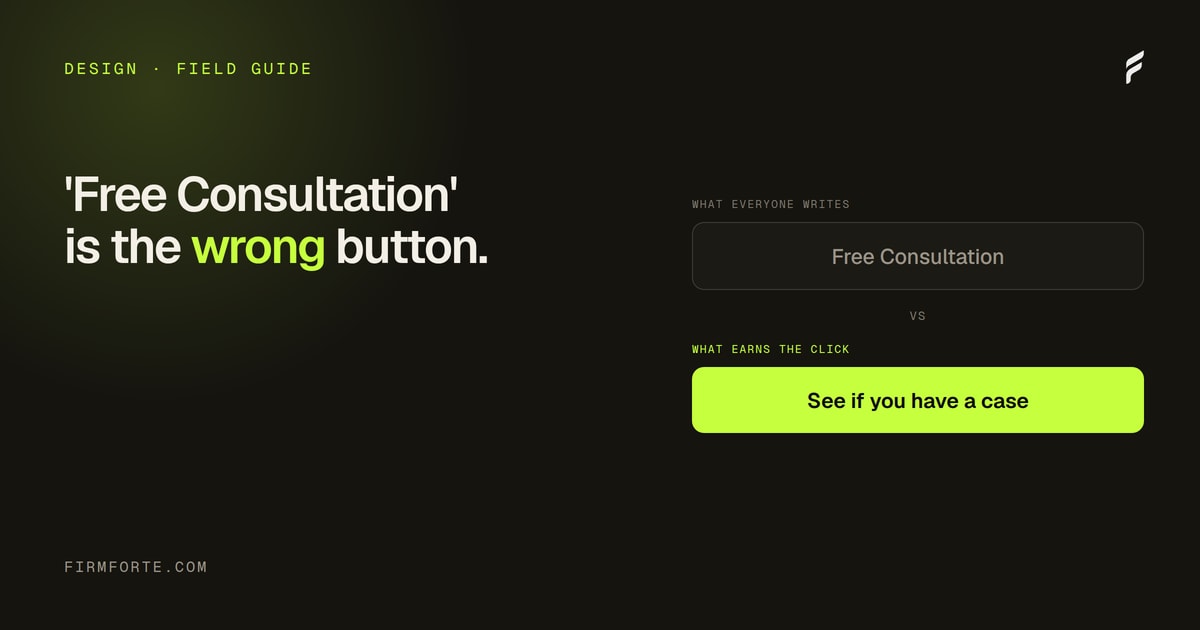
5. One clear next action
Not three CTAs. Not "Call Us" and "Email Us" and "Schedule a Consultation" and "Live Chat" all competing. One primary action, prominent, specific. Everything else demoted to secondary.
The CTA should be specific enough that the visitor knows exactly what happens when they click. "Schedule your free consultation" beats "Get started." "Call our intake line" beats "Contact us." "Request a case review" beats "Learn more."
Sub-actions can exist (a phone number in the corner, an email link in the footer) but they shouldn't compete with the primary CTA visually. If a visitor has to choose between three equal-weight buttons, most won't choose any of them.
The 5-second test
One way to know if all five are working:
Show your homepage to someone who has no context (a friend in a different industry, a family member, a random person). Give them five seconds. Hide the screen. Ask: what does this firm do? Where? Who runs it? What's the next step?
If they can answer those four questions, the page is doing its job. If they can answer two or fewer, all five elements need attention. Most law firm homepages we test fail this with two correct answers out of four. The ones that pass it convert at noticeably higher rates.
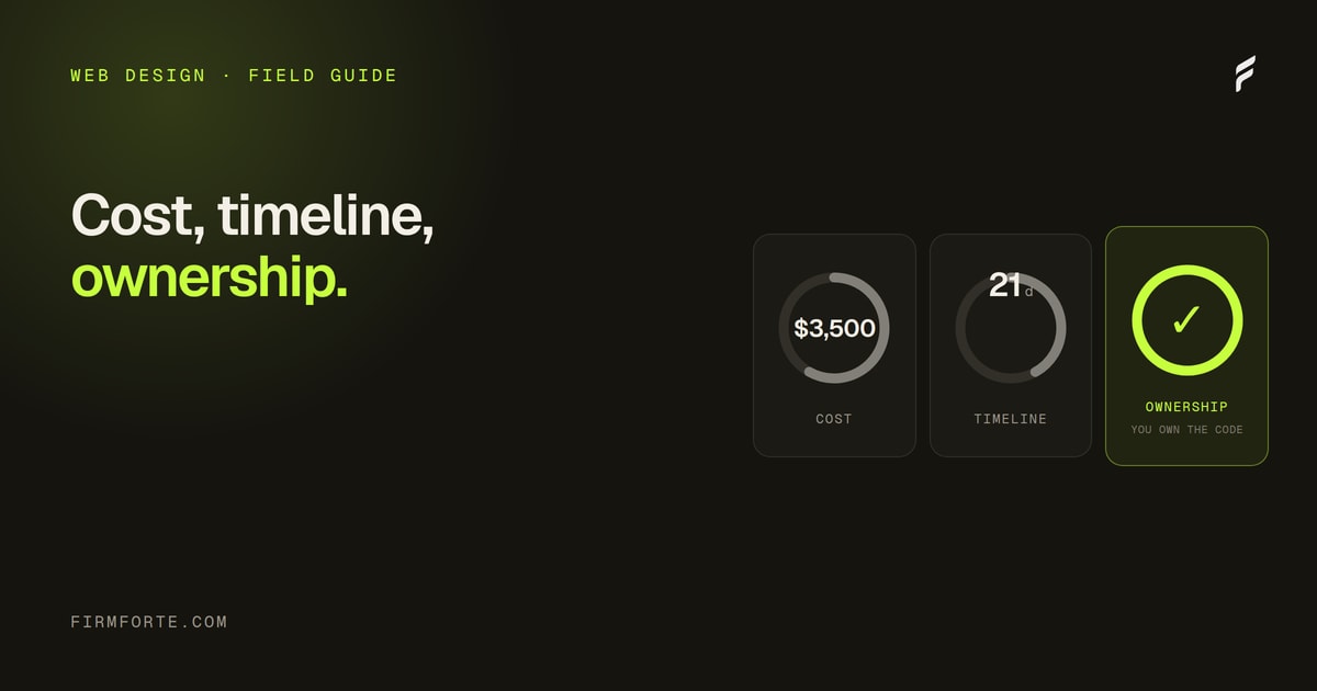
The homepage is one page in a small set that each has to earn its place, covered in the five pages every solo law firm website needs, and it sits inside the larger question of what a firm site should cost and contain, which we lay out in the guide to law firm website design, cost, and ownership. To see how your own homepage scores on these five and the rest of the signals that matter, run the free audit. Getting all five right is the baseline for every law firm website we design.