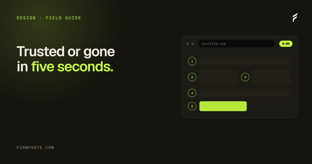
Open ten law firm websites at random. Count how many primary CTAs say "Schedule Your Free Consultation" or some variant. Most weeks the number lands at nine. Sometimes ten.
This isn't a coincidence. It's a copy-and-paste default that nobody questions. It also happens to be the wrong CTA for most law firm visitors, in most practice areas, most of the time.
The psychology of what's actually going on is worth understanding before you write a single button.
The visitor's actual state of mind
A potential client lands on a law firm site for one of three reasons:
Crisis — they were just arrested, just injured, just served. They want help in the next 30 minutes. They're not researching, they're triaging.
Investigation — they have a problem (an employer issue, a contract dispute, a planning need) and they're trying to figure out if it's worth getting a lawyer involved. They're vetting, not buying.
Browsing — they're not in a legal situation right now, but they're saving firms for later, or they're on the wrong site. Either way, low immediate intent.
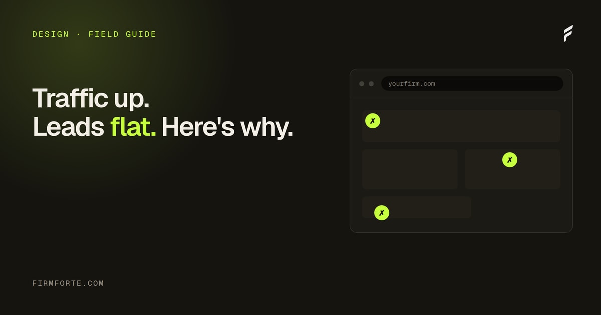
"Schedule Your Free Consultation" speaks reasonably well to the second group, awkwardly to the first, and not at all to the third. Most firms only ever optimize for the second group, then wonder why their conversion rate is mediocre.
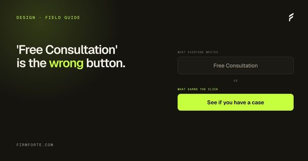
What "Free Consultation" actually says
Three subtle problems with the default phrasing.
"Schedule" implies effort. Pick a date, pick a time, fill out a form, wait. Someone in crisis doesn't want to schedule. They want to talk to a human right now.
"Free" can read as cheap. Especially in high-end practice areas (complex commercial litigation, estate planning for high-net-worth clients, sophisticated white collar defense). The word "free" pattern-matches against personal injury TV ads, which is fine if you're a PI firm and bad if you're not.
"Consultation" is a soft sell. It doesn't promise anything specific. The visitor doesn't know what they're agreeing to. Will they be on the phone for an hour? Will they be pressured to sign? Will they get advice or a sales pitch?
The phrase has the smell of being chosen by committee. Specific, definitive language converts better in almost every test.
One default vs matched to the visitor
One button for everyone
schedule your free consultation
"Schedule" means effort: pick a date, fill a form, wait
"Free" pattern-matches to late-night injury ads
"Consultation" promises nothing the visitor can picture
Same button on every page, whatever they came for
Matched to visitor and page
specific, definitive, per intent
PI: "Talk to a lawyer about your accident"
Criminal: "Call now, 24/7," not a calendar widget
Family: "Request a private consultation"
Estate: "Start your estate plan," names the deliverable
Rewrites by practice area
Concrete alternatives, tested on real sites:
Personal injury: "Talk to a lawyer about your accident." Direct, action-verb-led, names the situation. Works for car accidents, slip-and-falls, workplace injuries. Skip the word "free" because PI clients already know it's contingency.
Criminal defense: "Call now, 24/7." For most criminal defense practices the right CTA is a phone number, not a form. The visitor is often in crisis and a button leading to a calendar widget is the wrong response.
Family law: "Request a private consultation." The word "private" matters in family law in a way it doesn't elsewhere. The CTA acknowledges the sensitivity and signals discretion.
Estate planning: "Start your estate plan." Action-led, future-oriented, names the actual deliverable. Beats "Schedule a Consultation" because the visitor knows what they're starting.
Business and commercial: "Request a case review" or "Schedule an initial call." More restrained tone. Avoids the word "free" which reads as low-end in this segment. Specifies a deliverable (review, call) rather than a vague meeting.
Federal and complex litigation: "Talk with [attorney name]." Personal, attorney-focused, signals that the prospect is talking to the lawyer rather than an intake screener.
Match the CTA to the page intent
A more sophisticated version: vary the CTA based on which page the visitor is on.
On the homepage, the CTA should fit the most likely visitor (whatever your primary practice and audience is). On a practice-area page, the CTA should be specific to that practice. On an attorney bio page, the CTA should let the visitor reach that specific attorney. On a blog post, the CTA should match the post's topic (a post about DUI penalties should lead to "Talk to a DUI lawyer," not the generic homepage CTA).
Most law firm sites use the same CTA on every page. The CTA is rendered as a global component, written once, copied everywhere. This is a missed conversion opportunity on dozens of pages, and it compounds a related mistake: a strong CTA on a page that fails the basic trust test converts no one. The button is the last step, but the visitor has to believe you first, which is where the five homepage elements that build trust come in, and the CTA that undoes its own page is one of the five design mistakes that kill conversion on lawyer websites.
The "what happens next" test
One test for whether your CTA is good enough:
Read the CTA out loud. Then ask yourself: do I know exactly what happens after I click? Will I be on a calendar widget, on the phone, on an intake form, on a chat? How long will it take? Will I talk to an attorney or an assistant?
If the CTA leaves any of these unanswered, it's vague. The visitor's brain doesn't reward vague. Specific CTAs ("Call our intake line now — answered in under 2 minutes by a paralegal") convert better than vague ones ("Get Started") in almost every test we've run.
Specificity is the conversion lever. Most firms leave it on the floor. And it's testable: change one generic CTA to a specific, intent-matched one, watch the click and call rates over a few weeks, and let the numbers settle the argument. You don't need a redesign to fix your CTAs; you need to stop copying one default across a site full of different visitors.
The CTA sits at the end of a chain, part of what a firm site should cost and contain, covered in the guide to law firm website design, cost, and ownership. To see how your primary CTAs score against each page's real intent, run the free audit. Matching the CTA to each page is something we build into every law firm web design project.