

The short answer
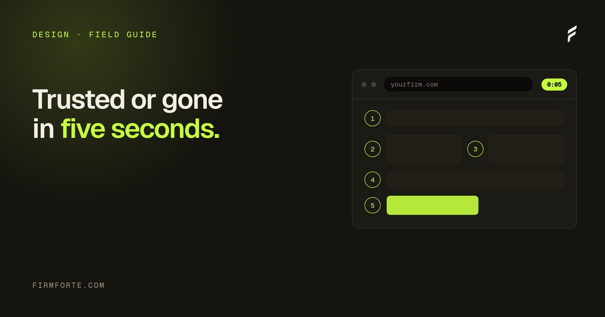
Five things cost law firm websites the most conversions: stock photography that signals interchangeable, headlines that could apply to any firm in the state, a phone number below the fold, trust signals that collapse on mobile, and lawyer-speak in the body copy. None of them are technical. All of them are decisions someone made, which means all of them can be reversed without a rebuild.
Here's a situation worth recognizing, because it is easy to misdiagnose. A firm invests in content for a year or more. Resource pages go up, the blog runs weekly, rankings arrive for the terms that matter. Traffic climbs, sometimes a lot. And consultations stay exactly where they were.
The instinct is to blame the traffic — wrong keywords, wrong intent, time-wasters. Sometimes that's right. Often it isn't: the visitors are local, they searched with clear legal intent, and they arrived on a page that answered their question. The problem sits downstream of traffic. The site is sending every new visitor back to Google to pick a different firm.
Five design choices do most of that damage. Each one is small enough that it survives a quick visual review, which is exactly why they persist. Here they are, with what to do about each.
Five small choices, one flat funnel
A gavel-on-books stock shot reads as a category, not a firm. Swap in the real office and the real attorney. A $300 to $600 shoot covers a homepage and a few service pages.
"Compassion. Experience. Results." fits every firm in the state. Take a position instead, and name the actual practice and approach. Some visitors bounce; the rest convert better.
About a third of law firm conversions start with a call. In the footer, that path is buried. Put the number in the nav, sticky on mobile, tap to call.
Four badges that read as one block on desktop stack into three scrolls of isolated claims on the phone, where most visitors actually are. A 2x2 grid keeps them cohesive.
"Dissolution of marriage" is what the court calls it. "Divorce" is what the client typed at 11pm. Write the pages in the words the audience already uses. Engines match those words too.
Mistake one: stock photography that signals "interchangeable"
The archetype: a homepage led by a stock photo of a gavel resting on a leather-bound law book, lit from above in warm gold. It is on the same stock library several hundred other law firm sites are drawing from.
The visitor's brain processes this in roughly 200 milliseconds. The pattern recognition runs: "law firm website," "looks like the others," "lacks distinctive identity." Trust signal: low. The visitor scrolls or leaves, almost involuntarily.
This isn't subtle. It's the strongest known visual trust signal on law firm sites, and most firms fail it. Stock photography says "we are not the firm; we are a category." Real photography (the actual office, the actual attorneys, the actual conference room) says "we are a specific firm."
The fix isn't expensive. A two-hour professional photo shoot, $300 to $600 depending on the market, produces enough imagery for a homepage and three or four service pages. Replace the gavel with a wide shot of the attorney in the firm's actual conference room, documents on the table. It is the cheapest of the five fixes and usually the most visible.
The five homepage elements that build trust piece covers the trust-signal hierarchy in detail. Photography is element one.
Mistake two: headlines that could apply to any firm
The archetype: an H1 reading "Atlanta Family Law Attorneys. Compassion. Experience. Results." It could apply to every family law firm in Georgia. It isn't false. It isn't bad. It is interchangeable, which on a page whose whole job is to distinguish you is the same as being absent.
Interchangeable headlines don't differentiate. They normalize. The visitor reads them and assumes the firm is, well, normal. They keep looking for something distinguishing. Usually they find it on a competitor's site that opened with a specific position instead of a generic credential.
Compare two H1s for the same firm.
Generic: "Atlanta Family Law Attorneys. Compassion. Experience. Results."
Specific: "Atlanta divorce, custody, and post-decree help, without the courthouse drama in most cases."
The second one takes a position. It implies a specific approach (settlement over litigation), names the actual practice areas, and uses a tone that distinguishes the firm from corporate-feeling competitors. Some visitors will read that and bounce because they specifically want a litigator. That's fine. The remaining visitors will be more qualified and substantially more likely to convert.
Headlines are the highest-impact hundred characters on the site. Most firms spend more time on Slack channel names than on their homepage H1. Worth fixing first. For the brand-positioning logic underneath this, the E-E-A-T guide walks through how specific positioning compounds into trust signals AI engines also recognize.
Mistake three: phone number buried below the fold
The archetype: the phone number lives in the footer. On desktop a visitor has to scroll to find it. On mobile they have to open the hamburger menu, find the footer link, and scroll again.
This is a small UX choice sitting directly on a conversion path. A large share of law firm inquiries start with a call rather than a form, and the share is highest in the urgent practice areas — someone who has just been arrested or rear-ended is not filling in a contact form. For every one of those visitors, the phone number's location is the conversion path. A buried number is a buried path.
The fix: phone number in the primary nav as a tap-to-call link, sticky on mobile, visible from any page at any scroll position. It is an afternoon of work and it is the highest ratio of result to effort on this list.
The behavioral case for why this works is in the psychology of law firm CTAs piece: friction kills calls more than poor headline copy does.
Mistake four: trust signals that collapse on mobile
The archetype: four real trust signals on the desktop homepage — a Martindale-Hubbell "AV Preeminent" badge, a Super Lawyers logo, a state bar membership badge, and a row of testimonial cards. All four sit in one horizontal strip below the hero.
On desktop this strip read as one cohesive trust block. The visitor saw all four signals in a single glance.
On mobile the strip stacked into a vertical column that took three full screen heights to scroll through. The visitor saw one signal at a time, isolated, often surrounded by whitespace. The cumulative trust effect that worked on desktop disappeared on mobile. Each badge read as a small isolated claim rather than as part of a credible whole.
This is the most under-diagnosed conversion problem on law firm sites, because the person who approved the design almost certainly reviewed it on a laptop. Most visitors arrive on a phone. The trust hierarchy that worked in the desktop comp gets quietly dismantled on the device that actually matters — check your own analytics for the split before assuming otherwise.
The fix is design-specific. Trust signals need to read as one coherent block on mobile too, which usually means a 2x2 grid, a horizontal scrolling carousel, or a single combined "credentials" card holding all four logos in one frame. The 2x2 grid is the safest default: it survives narrow screens without turning into a scroll.
Mistake five: lawyer-speak in the body copy
This one is harder to fix because it requires the firm to break a habit.
The archetype: a practice area page opening "Our firm's practice encompasses the representation of clients in domestic relations matters, including dissolution of marriage, post-decree modifications, and matters of parental rights and responsibilities." Grammatically correct, legally precise, and conversionally dead.
The visitor isn't a lawyer. The visitor is a parent who's been served with divorce papers and is googling at 11 PM. They don't speak the language of "dissolution of marriage." They speak the language of "divorce." They don't search for "matters of parental rights and responsibilities." They search for "child custody."
Every sentence written in lawyer-speak instead of client-speak loses some fraction of the visitors who can't quickly map the legal terminology back to their actual situation. Most visitors don't ask for a translation. They leave.
The fix: rewrite the body copy of every public-facing page in the language clients actually use. "We handle divorces, child custody disputes, and modifications of existing court orders." Not "our practice encompasses." This isn't dumbing down content. It's translating legal accuracy into the words the audience already uses. Court documents stay in lawyer-speak. Marketing copy doesn't.
The bonus effect: AI engines also do better with client-speak. ChatGPT cites pages that match the language of the query. Visitors search "child custody," not "parental rights and responsibilities." Pages written in the client's language match more queries than pages written in the lawyer's language. Entity reinforcement works the same way: consistent, plain-language naming compounds.
Rewriting a set of practice area pages this way is roughly a day of work per page, most of it spent deciding what the page is actually for. It is the slowest fix on this list and the one that also does the most for how AI engines read the page, since they match the words a person actually used too.
The order to fix them in
Ship these cheapest-first, because the cheap ones are also the fast ones and you want something moving while the slow work is in progress. Photography first. Then the phone number, which is an afternoon. Then the mobile trust strip and the lawyer-speak rewrite, which are the real work. Headlines last, because a good headline depends on positioning being settled, and that conversation always takes longer than anyone budgets for.
None of this needs more traffic. That's the part worth holding on to: if the visitors are already local and already searching with legal intent, the funnel doesn't need to be wider. It needs to stop leaking.
Measure it on your own site rather than trusting a number from a blog post — including this one. Before you change anything, write down your current monthly form submissions, calls from the website, and homepage bounce rate. Change one thing at a time. The comparison only means something if it's yours.
The four mistakes worth not making in the first place
Three of the five mistakes are expensive to fix late and cheap to avoid up front. Worth flagging for any firm considering a new site or a redesign.
Stock photography. Don't ship a site without real photos. If a photo shoot can't happen before launch, ship with no photos rather than stock photos. The negative-space version reads as deliberate. The stock-photo version reads as generic.
Generic headlines. Write the H1 as the last step in the design process, not the first. Headlines drafted before the firm has a clear positioning end up generic. Headlines drafted after the positioning is settled end up specific.
Hidden phone numbers. Phone number in primary nav, sticky on mobile, tap-to-call enabled. Non-negotiable.
Lawyer-speak. Hire a non-lawyer to read every page of the site out loud before launch. If they stumble on a sentence, rewrite it. The senior partner shouldn't be the final reader on marketing copy. The senior partner already speaks lawyer-speak.
For how all of this fits into the broader site architecture (where your resource content lives, how visitors navigate between practice areas and education), see how to design a law firm knowledge hub. Conversion fixes on individual pages compound when the site as a whole is built right.
What this looks like as a real engagement
For a firm whose traffic is fine and whose conversions aren't, the conversion-recovery work usually fits inside a 30-day rebuild at our Launch tier ($3,500). Photography, headline rewrite, primary nav redesign, mobile trust block reconstruction, and a 10-to-15 page body-copy rewrite. The live law firm sites we've built show what that finished work looks like in production.
For a firm that needs the full site rebuilt because the underlying structure is also broken, this work folds into a larger Launch + Grow engagement (Launch tier plus monthly retainer).
The honest answer is that nobody can quote conversion fixes accurately without seeing the site. Send us your URL. We'll audit the five mistakes, identify which ones are costing you the most, and come back with a real quote for what it would take to fix them. Free, no card required, no obligation to hire us afterward.
Questions we get about this
-
What hurts conversion most on a law firm website?
Being indistinguishable from every other firm the visitor has open in another tab. Stock photography, a headline that could carry any firm's name, and copy written in legal register all push toward the same outcome: nothing on the page gives a reason to pick you. That's a bigger loss than any single layout problem, because a visitor who can't tell you apart doesn't call anyone. Fix specificity before you fix anything cosmetic.
-
Do stock photos really hurt a law firm website?
Yes, and more than most firms expect, because prospective clients have seen the same images on competitors' sites. A gavel, a generic handshake, or a stock conference room signals that nobody at the firm was willing to appear on their own website, which is the opposite of the trust the page is trying to build. A plain photograph of the actual attorneys in the actual office beats a polished stock image every time. If the only barrier is that nobody likes being photographed, that's still cheaper to solve than the conversions it costs.
-
Where should a law firm put its phone number?
In the header, visible without scrolling, on every page and especially on mobile. A large share of legal inquiries start with a call rather than a form, and the share is highest in the urgent practice areas — someone who has just been arrested or rear-ended is not filling in a contact form. For those visitors the phone number's position is the conversion path, so burying it below the fold removes the path entirely. Make it tappable on mobile rather than plain text.
-
Do I need a full redesign to fix these?
No, and a redesign is usually the more expensive way to avoid the real problem. Four of the five are copy and asset decisions — the headline, the photography, the body copy, the phone number's position — and all four can change on the existing site this week. A redesign that carries the same generic headline and the same stock photos forward fixes nothing at ten times the cost. Fix the content first, then decide whether the design is genuinely the constraint.