
The short answer
The best law firm websites aren't the prettiest ones. They're the ones that look like a specific firm rather than a template, say plainly what they do, load fast on a phone, make the next step obvious, and can be read by both people and search engines. Design awards, animation, and big budgets don't predict any of that. What separates a great law firm site from a generic one is a handful of decisions, most of them fixable without a full rebuild.
Search "best law firm websites" and you get galleries. Twenty screenshots of handsome homepages, ranked by how they look at a glance. It's a satisfying way to spend ten minutes and a misleading way to decide what your own site should be, because looks are the easiest thing on a website to copy and the least predictive of whether it actually brings in clients.
"Best" is doing a lot of quiet work in that search. It usually means "most attractive." It should mean "most effective" — the site that takes a stranger who's just been referred to the firm and turns them into a phone call. Those are not the same list. A gorgeous site can leak every visitor it earns, and a plain one can convert them all. Building for the second list is the whole premise behind the law firm websites we build to be found and chosen.
So here's the more useful version of the question: what do the law firm websites that actually work have in common? It comes down to a short list of properties. None of them is about being beautiful, and most of them are fixable on the site you already have.
What separates a great law firm site from a generic one
Real photography of the actual attorneys and office, not a stock gavel every visitor has already seen on three competitors' sites.
What the firm does and who for, in the words clients use, understandable in a glance rather than after a paragraph of "our practice encompasses."
Most visitors arrive on mobile. A slow or awkward phone experience reads as a careless firm before a word is read.
A tappable phone number in the nav and a short, low-pressure way to make contact, visible from any page without scrolling.
Real names, real results where the rules allow, genuine reviews. "Trusted and experienced" is what every competitor says and no visitor believes.
Clean structure, honest content, and pages a browser can read with the scripting off — because if a browser struggles, a search engine and an AI model will too.
It looks like one specific firm, not a template
The single strongest signal on a law firm homepage is whether it looks like a real, particular firm or a category. A stock photo of a gavel on a leather book, a generic skyline, a staged handshake — a visitor has seen all of them, and their brain files the site under "law firm, like the others" in a fraction of a second. Real photography of the actual attorneys in the actual office does the opposite: it says "this is a specific firm, run by these specific people."
This is also the cheapest of the properties to get right. A short professional photo shoot covers a homepage and a few service pages, and it moves the needle more than any amount of layout polish. The homepage trust hierarchy starts here for a reason.
It says what it does in plain words
The best law firm websites are legible in a glance. The headline names the practice and takes a position; the body copy is written in the words clients actually type, not the words courts use. A parent served with divorce papers at 11pm searches "child custody," not "matters of parental rights and responsibilities." A page written in the client's language reaches more of them — and, as it happens, matches more of the queries engines are asked, too.
Generic isn't false; it's invisible. "Compassion. Experience. Results." could carry any firm's name, which on a page whose whole job is to distinguish you is the same as being blank. Specific language is the difference, and it's the subject of most of the conversion mistakes worth avoiding.
It's fast and works on a phone
Speed and mobile are part of the impression, even though nobody thinks of them that way. Most people who find a law firm are on a phone, often on an imperfect connection. A page that takes its time to load, or shifts around as things pop in, feels careless before the content even registers. A fast, stable, mobile-first site quietly removes friction that most competitors leave in place.
None of this requires a heavy, expensive build. It usually requires the opposite: a light site, sized images, and no unnecessary scripts. Heavy "premium" templates are frequently the thing making a site slow.
The next step is obvious
Once a visitor is interested, the best sites don't make them hunt. A tappable phone number sits in the navigation, visible from any page; a short, low-pressure contact path is never more than a scroll away. A large share of legal inquiries start with a call rather than a form, and in the urgent practice areas that share is highest — a buried phone number is a buried conversion path. A great impression that dead-ends into a hidden contact form is a client lost at the finish line.
It earns trust with specifics, not adjectives
Trust on a law firm site is built with concrete things: named attorneys with real bios, genuine reviews, and results stated the way the advertising rules allow. Vague reassurance — "trusted," "aggressive," "results-driven" — is what every competitor writes and what no prospective client believes. Where a firm can show something real and specific, it should; where it can only assert, it's better off saying less. This is also the honest line to hold: a website presents on-site trust signals, and no site should imply an outcome it can't stand behind.
It's built to be found — and read by machines
A site nobody finds isn't doing its job, however it looks. The best law firm websites have clean structure, sensible URLs, and honest content, and — increasingly — they're built so a machine can actually read them. If a page only assembles itself with a pile of JavaScript, a browser with scripting off sees very little, and so do the search engines and AI models trying to summarize it. Building pages that are readable without JavaScript is a plain hygiene decision that pays off in both search and AI answers. Schema and the rest are hygiene too, not a magic trick — they help engines understand facts you've already made true, and nothing more.
What "best" doesn't mean
A few things get mistaken for quality and aren't. Animation and scroll effects are fun to build and usually a net cost — more weight, more distraction, more to break on a phone. A large budget guarantees nothing; plenty of expensive sites hide the phone number and read like a brochure. And a spot on a "best law firm websites" list is a screenshot verdict, not a performance one — worth borrowing an idea from, never worth copying wholesale, and stale the moment the firm redesigns. A more honest reference is a set of sites you can click into and test yourself: the live law firm sites we've built are all real production sites on real traffic, not gallery screenshots.
Judge your own site
The fastest way to see where a site stands is to look at it the way a stranger would. Try this before you trust any gallery:
Try this yourself
Read your homepage like a stranger
Here's a law firm homepage headline: "[your homepage headline]". In one sentence, tell me what this firm does, who it's for, and one reason to choose it over another firm — using only that headline.
Opening a link sends the prompt to that company, the same as typing it there yourself. Nothing is sent to us.
If the answer is thin, the headline is doing too little. Then walk the rest of the list, on your phone, honestly:
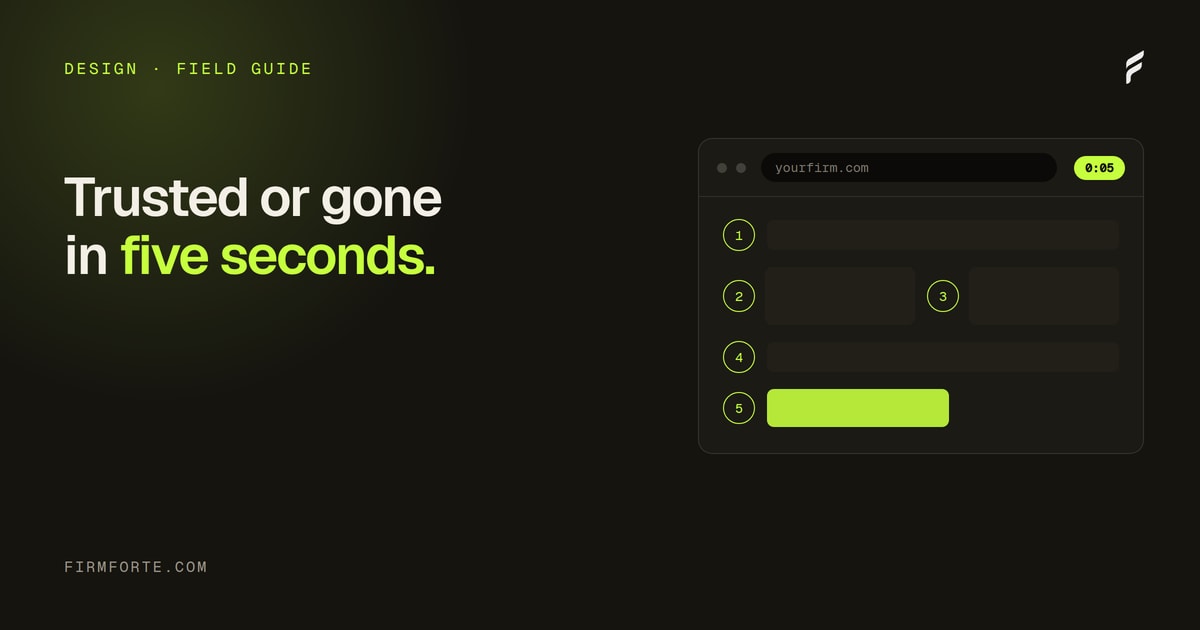
- Within about five seconds, can a stranger tell what the firm does and who it's for?
- Are the photos of the real attorneys and office, not stock?
- Is the phone number tappable and visible in the nav without scrolling?
- Does the page load fast and hold still on a phone, without shifting as it loads?
- Is the copy in the words clients use, not the words courts use?
- Do the trust signals point to something specific and real?
- With JavaScript off, is the main content still there?
Most of what separates the best law firm websites from the forgettable ones shows up in that list, and most of it is a content or decision fix rather than a rebuild. The prettiness you can safely leave for last. If you'd like an outside read first, the free review shows what your site looks like to the systems — and the people — deciding whether to call you.
Questions we get about this
-
What makes a law firm website good?
A good law firm website is clear, fast, and unmistakably about one specific firm. A visitor should understand what you do, who you do it for, and how to reach you within a few seconds, on a phone, without hunting. The prettiest sites often fail this because looks are the easiest thing to copy and the least predictive of results. Judge a site by whether it earns a call, not by whether it wins a design award.
-
Do the best law firm websites have to be expensive or custom-built?
No. Price and platform matter far less than the decisions on the page. A clean, fast, honest site on a mainstream platform beats an expensive one that hides the phone number and reads like a brochure. Custom design helps a firm look distinct, but a big budget spent on animation and stock photography buys none of the things that actually convert. Spend on clarity, real photography, and speed before you spend on polish.
-
Are 'best law firm websites' lists worth paying attention to?
For inspiration, a little; for a verdict, no. Most roundups rank sites on how they look in a screenshot, which is the one dimension that says nothing about whether the site brings in clients. They also go stale as firms redesign. Use them to collect ideas you can borrow responsibly, then judge any site — including your own — against what actually earns trust and calls, not against a gallery.
-
How can I tell if my own law firm website is any good?
Open it on your phone and time yourself. If you can't tell what the firm does, who it's for, and how to call within about five seconds, neither can a prospective client. Then check the slower things: real photos instead of stock, a headline only your firm could use, a phone number in the nav, and pages written in the words clients type rather than the words courts use. Most weaknesses show up in that first honest look.